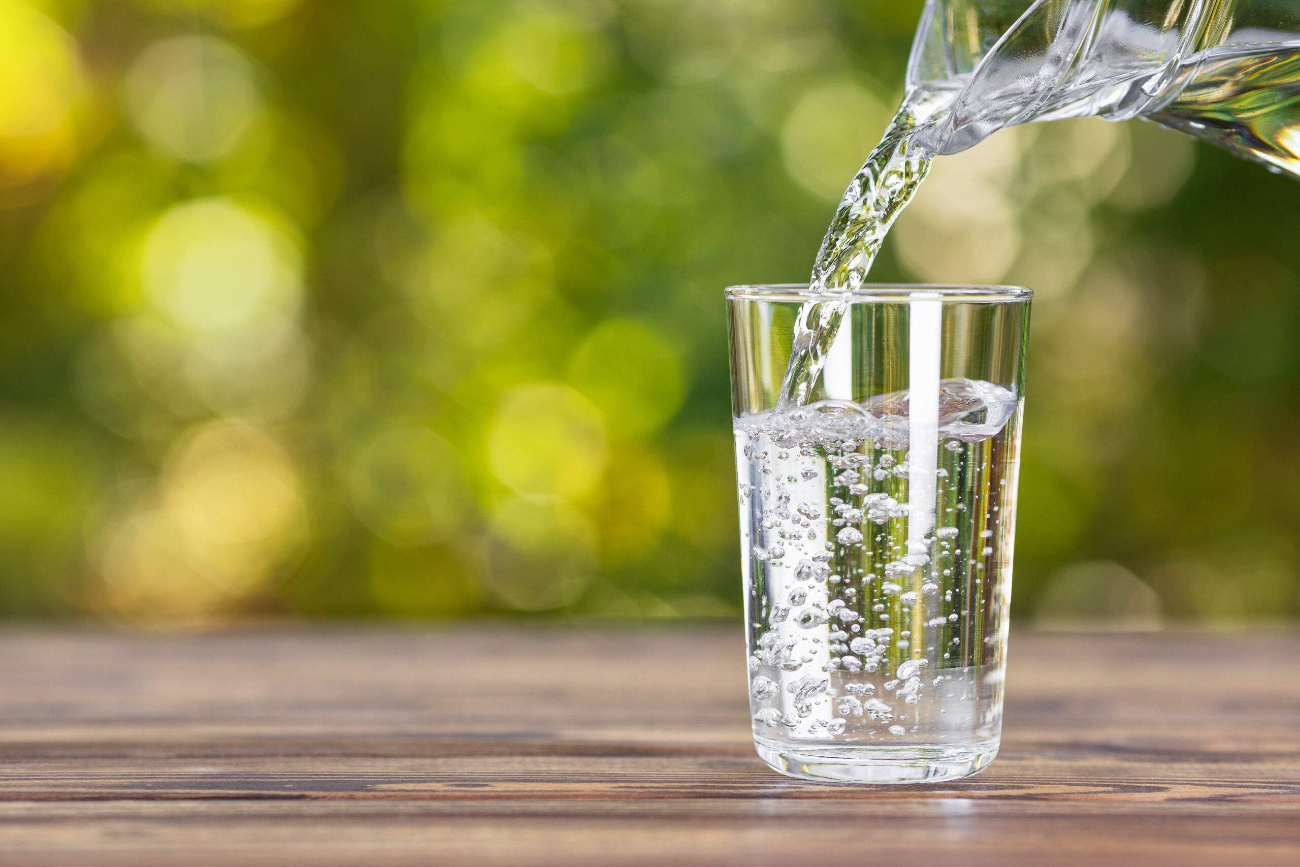
Clean, modern, nature-aqua.
A polished, contemporary direction. Aqua and sage palette, soft gradients, wave dividers, rounded cards, and a custom inline water-glass illustration that floats in the hero.
Each direction keeps the natural, refreshing spirit of Pebble Spring — but takes the design somewhere different. Click into any one to explore the live homepage, then use the bar at the top of each variant to jump between them.
A polished, contemporary direction. Aqua and sage palette, soft gradients, wave dividers, rounded cards, and a custom inline water-glass illustration that floats in the hero.
A warmer, more contemplative direction. Cream paper backgrounds, forest green with copper accents, Playfair Display serif headlines, asymmetric photo captions, and a "Field Notes" tone throughout.
A dramatic, immersive direction. Full-bleed mountain-spring photography in the hero, a floating glass navigation bar, Manrope bold display typography, premium product tiles, and a "Water With a Purpose" tone.
Identical to Site 3 — full-bleed photography, premium product tiles, marquee strip — but with a clean, sticky white header instead of the dark floating glass nav. Easier to read, more traditional, and lets the hero photography breathe below.